|
1. Impact information at a glance
|
You can create your own scorecard below. |
2. Codify your worldview
The idea of what is positive or negative impact (sustainability) is often subjective. The interpretation of evidence is influenced by personal opinion or a particular institutional culture - impact is in the eye of the beholder. That is why we made the scorecard interactive, so that you can weight the underlying data to reflect your values and ethical priorities, or the institution that you work for, or to correct any perceived biases in the underlying data.
3. Make decisions relevant to your priorities
The scorecard amplifies the aspects of impact that you prioritise and suppresses those that you think are unimportant. As a result, the scorecard is a practical tool for organising and ranking impact data about realworld situations in a way that reflects your personal values and ethical perspective.
It is increasingly important to understand the broader impact of the products we buy, the businesses we run, and the investments we make - beyond only financial. However, non-financial evaluation does not have a long history and there is no standard methodology. Different assessors can assign widely different ratings. As a result, there is almost no correlation of headline impact data*. It is consequently very difficult for people to understand the impact of their economic activity without first becoming an expert in the complex methodologies of impact assessment, and therefore nearly impossible to make quick decisions in an informed way.
* See pg 11 of this report by the Japanese Government's pension fund
iSumo would like to make it easy to understand the impact of economic decisions. For example, when choosing between similar products in a grocery store, when considering two alternative vendors for the supply chain of a factory, or selecting between comparable investments for your pension fund, and so on. It needs to be quick to understand impact information, and simple to summarise this information to the level you need for making decisions.
Ideally, we should also be able to assess different things in a similar and comparable way - like money allows us to compare the prices of an apple versus a car, and financial accounting enables us to compare the profitability of an apple farm with a car company. When it comes to impact, we should be able to compare the respective impact of buying an apple with buying a car, or making a train journey compared with drinking a bottle of beer, or making an investment compared with how a city council allocates its budget.
The iSumo interactive scorecard enables you to do this by incorporating the following design principles:
Recent academic research shows that images, specifically emojis, are more effective than numbers at communicating deeper and more subtle insights about sustainability issues. The iSumo graphic intentionally looks like an eye to harness our ability for deducing complex information about other people via eye contact. For example, dilated pupils can indicate affection, large eyes are often considered attractive or they can stimulate our nurturing instincts, and bloodshot eyes are typically a sign of something bad.
The design is inspired by the imagery of Doughnut Economics, which informs the positioning of the three inner rings that represent people, prosperity, and planet. These three rings reflect the actual non-financial effects that an entity is responsible for. The outer two grey rings reflect the potential of an organisation for achieving non-financial effects. The fourth ring (of three grey dashes) represents the practices of an organisation or entity, and reveals how much it is proactively transforming its operations towards being more sustainable - think of it as representing internal barriers to sustainability. The 5th and outer ring (dotted grey) represents the purpose of an entity in terms of how intentionally it has already integrated sustainability into its fundamental mission - think of it as representing the external barriers to sustainability. All five of categories of impact are aligned with the five criteria of the Social Value 99 index.
The scorecard requires that each of the five categories of impact is assigned a score out of 100. This principle is also adopted by CSRhub. Such a decimalised system makes it easy to compare each on a like for like basis and to calculate averages. The scorecard can be universally applied at any level of scale, and for different things, because they all use the same decimalised system. This makes it easy to aggregate and disaggregate impact data, and to roll up summaries from one level to the next. For example, the scorecard could include impact data for vendors in a supply chain, which can be rolled up and summarised at the level of the product being manufactured, and further rolled up to the level of the company manufacturing numerous products, and again at the level of a fund investing in multiple companies, and so on.
This is a principle of accounting that allows some flexibility in the methodology for how each of the individual five impact scores are determined, but requires that they share a common conceptual definition. Structuring the data in the same way means that they can be consistently processed by the scorecard, which facilitates better high level comparability.
The flexible part of bounded flexibility inherently leads to variations in the resulting impact data. The scorecard can therefore be labelled to show the source of the data. This allows people to assess for themselves how confident they should be in data, whether they should discount the results, or weight the data to counter any subjective biases they believe may be embedded in the original analysis. This will also enable people to differentiate between self-reported data and independently verified data, or to rebalance data that may have a strong emphasis on one aspect of impact over another.
The scorecard excludes traditional financial performance data and economic data, and instead the prosperity category tracks equitable governance and fair distribution of wealth. The principle of separating non-financial data from financial data is adopted from the Social Progress Index because it enables better regression analysis. Deeper insights are possible by analysing the interrelationship between purely non-financial and financial attributes, which enables more nuanced judgment and more refined decision-making. Incedentally, the Social Progress Index also uses a decimal scoring system out of 100 like the iSumo scorecard.
This overcomes a significant problem with many existing sustainability rating systems and impact assessments because the source data and subjective evaluation are often inextricably combined according to a specific methodology, which typically embeds the worldview biases of the assessor or institution that developed the system. This means that ratings done according to one methodology are not comparable to those done according to another methodology. Nor does it allow for different methodological interpretations of the same underlying data, nor to evaluate or weight the data differently in order to test the data against alternative worldviews. The iSumo scorecard resolves this by separating (as best as practicable) objective data from subjective weighting of data by the observer. For each underlying data point, there can be any number of different interpretations of impact depending on differences in context, the subjectivity of the evaluator, or their ethical perspective.
Download a sample CSV file (here) and replace the contents with your own. You can have as many rows as you want, but you must use the same format. All impact scores need to be between 0 and 100, and the column headings need to remain unchanged. Load the CSV file into your browser using the button below, then click "Create scorecard" to populate the scorecard with your data.
All data processing is done by your web browser on your device - iSumo cannot see it, nor keep a copy of it, nor share it with anyone else.
Disclaimer: The iSumo Interactive Impact Scorecard is currently free to use and provided "as is" during the prototype stage. The judgement of the user should prevail at all times. Nothing herein should be considered a recommendation nor formal classification of any kind. iSumo offers no warrantee and accepts no liability over the results, nor any inferences or conclusions drawn therefrom. All data uploaded and the resulting data published by this scorecard always belongs to the original owner of the data. iSumo has no rights over the data whatsoever. This web app, its methodology, and visualisation (the widget) are protected by copyright and not yet intended for commercial use, please email contact@isumo.cloud if you are interested in using this service when is commercially available. iSumo is developed by EngagedX.
|
What is this dataset about?
|
Where did the data come from?
|
What is your name?
(or who weighted the impact score?) |
You can configure the dynamic scorecard to reflect your different priorities. The weighting for each impact category of purpose, practice, people, prosperity, and planet can be individually adjusted to reflect your world view.
Click ![]() above the score to increase the priority of that category, or click
above the score to increase the priority of that category, or click ![]() to reduce the priority.
to reduce the priority.
The visualisation, impact scores, and the ranking order of the scorecard will adjust automatically.
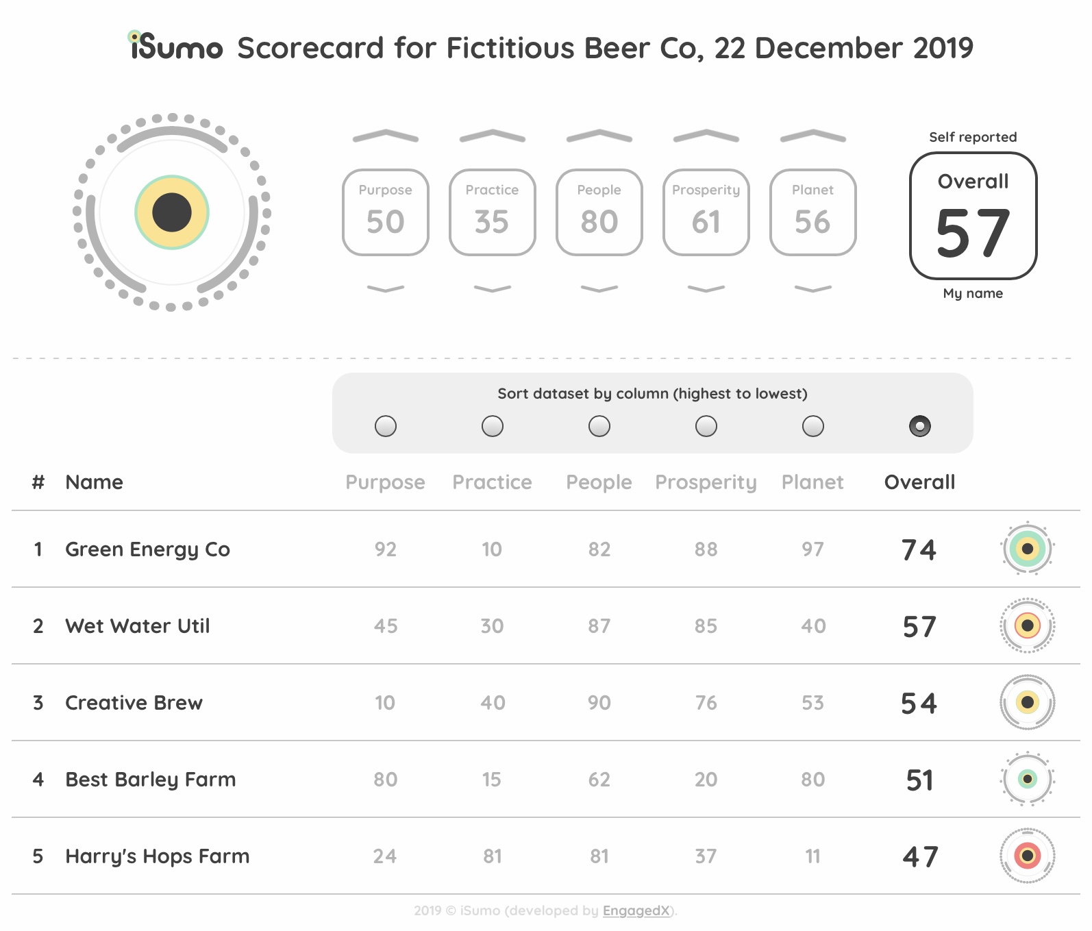
An impact score for any impact category of around 50 is good, much less than 50 is poor, and much greater than 50 is excellent. The maximum for each impact category is 100, and the minimum is 0. Each category is summarised at the top of the scorecard, also with a score out of 100. The overall impact score for the whole dataset is displayed at the top right, again as a score out of 100. The overall score is an average of the summary scores for the five categories of purpose, practice, people, prosperity, and planet.
The overall impact score includes a label above it to record the source of data, and below it to record the party who did the weighting i.e. the two parties whose collective worldview is reflected in the overall impact score. This is done because the overall score is fundamentally a function of the assessment or judgement of these parties, and the ultimate interpretation of impact should be done in this context.
The scorecard can be sorted by each category of impact (using the radio buttons above each column), which re-orders (ranks) the scorecard by that criteria.
The scorecard is customised by assigning priorities to each of the five impact categories (using the arrow buttons in step 3 above). This reflects the values and ethical perspective of the party doing the weighting. This party could be an individual, an organisation, or the policy priorities of a government or local authority.
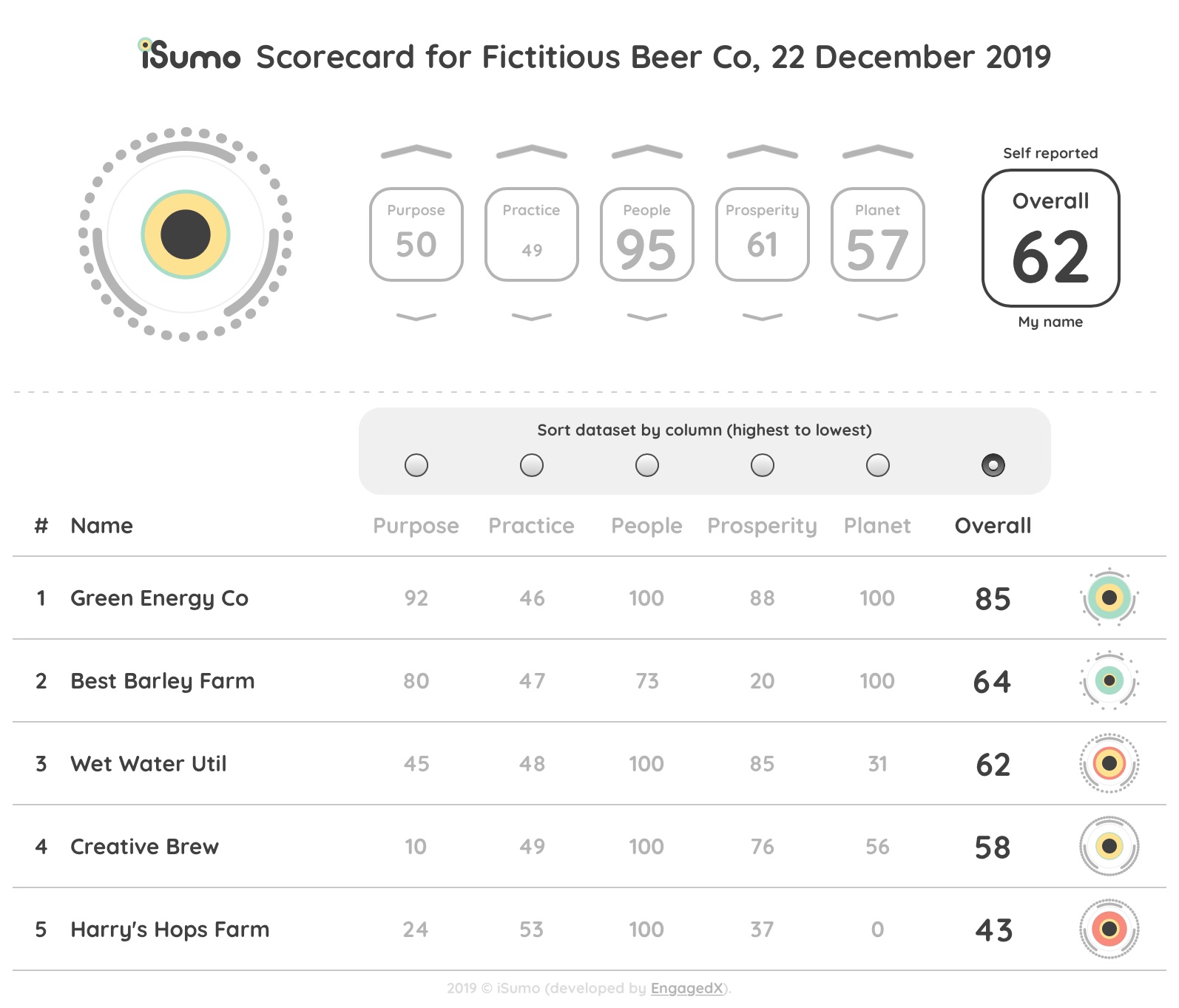
Notice how the order of the items in the scorecard is updated when the impact scores are weighted, and how the graphic on each line changes subtly accordingly. For example, prioritising planet causes the two companies "Green Energy Co" and "Best Barley Farm" to be elevated to the top of the ranking because of their strong environmental credentials. Therefore, for people who share this priority, it is easier to compare items according to their values. As a result, they are able to quickly make a more informed purchase or procurement decision.
The prioritisation also changes the size of the summary scores for each category, either larger to reflect a higher priority or smaller to reflect a lower priority.
|
Decreasing the importance of a category suppresses its score and brings it closer to the midpoint of 50, this moderates the influence that particular category has on the overall score. Increasing the importance of a category amplifies its score either up or down from the midpoint of 50, and thereby increases the influence it has on the overall score (either up or down respectively). In other words - the prioritisation influences the sensitivity of the overall score to the individual scores for each impact category. This is applied to each line item of the scorecard as well as the summary at the top.
Both scorecards above reflect exactly the same underlying dataset. However, notice how the scores and the graphic on each line are subtly different as a result of the weighting, as well as the order (ranking) of the list. The summary scores and overall score at the top are also different. All scores are adjusted to a curve to enable better comparative analysis that is more relevant to the worldview of each individual observer - because the notion of what is impactful (or not) is in the eye of the beholder.
The examples below isolate each impact category (keeping all others at a neutral setting of 50) to show how they individually affect the visualisation of the scorecard. At the bottom, examples are included that show the extreme effects possible if all the individual impact scores are either at the maximum of 100 or minimum of 0, either side of a neutral score of 50.
| Maximum (0) | Neutral (50) | Minimum (100) | |
|---|---|---|---|
| Purpose This is represented by the outer grey ring of dots. Highly sustainable aims and mission result in fewer dots until the grey ring disapears, whereas aims and mission that are not sustainable result in more dots until the grey ring becomes solid. Think of it as either breaking down (or building up) barriers to the outside world. |

|

|

|
| Practice This is represented by the inner grey ring of three line segments. Deployment of more internal resources towards positively transforming an organisation is represented by shorter lines until they disapear, whereas deployment of fewer internal resources is represented by longer lines until the ring is closed. Think of it as either breaking down (or building up) internal barriers within the organisation. |

|
|

|
| People This is represented by the dark inner circle. A strong focus on strengthening the foundations of social wellbeing results in a larger inner circle, whereas a less positive (or negative) focus result in a smaller inner circle. |

|
|

|
| Prosperity This is represented by the golden yellow ring. Equitable governance of an organisation and fair distribution of proceeds is represented with a thicker golden yellow ring, whereas less positive (or negative) activities result in a thinner golden yellow ring. |

|
|

|
| Planet This is represented by the outer rings of either green or red. An organisation that operates within the planetary boundaries (or creates net positive ecological impact) results in a thicker green ring, whereas exceeding planetary boundaries and causing negative ecological impact results in a thicker red ring. |

|
|

|
| Overall impact scores This row shows the extremes that are possible by either maximising or minimising all of the five impact categories. |

|
|

|
For more information email contact@isumo.cloud. iSumo is developed by EngagedX.