Widget      Scorecard

The Impact Widget

An interactive tool for visualising impact scores

- Step 1 [of 3] -
Label the widget

What entity is this about?
Where did the data come from?
What is your name?
(or who weighted the impact score?)

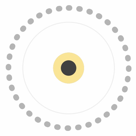
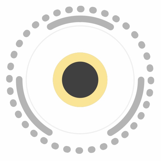
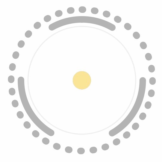
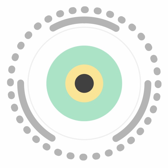
Watch how the widget changes when you adjust the sliders

The sliders on the left adjust the impact scores in terms of purpose, practice, people, prosperity, and planet.

Set the radio buttons on the right to amplify the areas of impact that you feel are more important, or suppress those that are less important to you. This functionality is important because the interpretation of impact is personal - everyone has a different opinion of what is good or sustainable based upon their values.

The widget therefore allows you to codify your worldview by weighting each impact category according to your ethical priorities. The result is to calibrate both the impact scores and how the widget is rendered to reflect your personal biases.

Impact score Weighted impact score
- - - - - --->
Set the individual impact scores for each category
How important is each category of impact to you?
Purpose: (Corporate aims, mission and positive intentionality)
Purpose (weighted):
Not very Somewhat Extremely
Practice: (Proactive transformation towards positive purpose)
Practice (weighted):
Not very Somewhat Extremely
People: (Foundations of social wellbeing)
People (weighted):
Not very Somewhat Extremely
Prosperity: (Equitable governance & fair distribution of proceeds)
Prosperity (weighted):
Not very Somewhat Extremely
Planet: (Ecological planetary boundaries)
Planet (weighted):
Not very Somewhat Extremely
2019 © iSumo (developed by EngagedX)

- Step 3 [of 3] -
Interpreting the widget

An impact score for any category of around 50 is good, much less than 50 is poor, and much greater than 50 is excellent. The maximum for any category is 100, and the minimum is 0. The total impact score is an average of the individual scores for the five categories of purpose, practice, people, prosperity, and planet. The total impact score is displayed within the widget as a score out of 100, together with identifiers for the source of data and who did the weighting i.e. the two parties whose collective worldview is reflected by the total impact score. This approach is in keeping with two accounting principles of construct-based equivalence and bounded flexibility. This alows flexibility in how each of the individual 5 impact scores are determined, but requires that they share a common conceptual definition and are always processed by the widget in the same way to enable comparability.

The examples below isolate each impact category (keeping all others at a neutral setting) to show how they individually affect the visualisation of the widget. At the bottom, examples are included of total impact visualisations that show the extreme effects possible if all the individual impact categories are either maximised or minimised.

[NOTE: the images below relate to a previous version of the widget, they will be updated shortly...]

Maximum Neutral Minimum
Purpose
is represented by the shape and size of the grey background. Highly sustainable aims and mission result in a smoother and smaller perimeter, whereas aims and mission that are not sustainable result in a serrated edge and larger perimeter.
Purpose_min Purpose_mid Purpose_max
Practice
is represented by the shade of the grey background. Deployment of more internal resources towards positively transforming an organisation is represented by lighter grey. Therefore, even if an organisation currently has a non-sustainable purpose, the act of investing in positive transformation softens the visual appearance of any jagged perimeter.
Practice_min Practice_mid Practice_max
People
is represented by the dark inner circle. A strong focus on strengthening the foundations of social wellbeing results in a larger inner circle, whereas a less positive (or negative) focus result in a smaller inner circle.
People_min People_mid People_max
Prosperity
is represented by the golden yellow ring. Equitable governance of an organisation and fair distribution of proceeds is represented with a thicker golden yellow ring, whereas less positive (or negative) activities result in a thinner golden yellow ring.
Prosperity_min Prosperity_mid Prosperity_max
Planet
is represented by the outer rings of either green or red. An organisation that operates within the planetary boundaries (or creates net positive ecological impact) results in a thicker green ring, whereas exceeding planetary boundaries and causing negative ecological impact results in a thicker red ring.
Planet_min Planet_mid Planet_max
Total impact scores
show the extremes that are possible by either maximising or minimising all of the five impact categories. Notice how the maximum and minimum of the total impact score is 100 and 0 respectively, whereas previously isolating each of the five categories only changed the total score by a maximum of +10 or -10 i.e. one fifth of the total.
Total_min Total_min Total_min
2019 © iSumo (developed by EngagedX)